Opuszine Is Dead! Long Live Opus!
I realize that this entry’s title is rather melodramatic, but it seems fitting — if only to me — given the recent changes that have taken place to Opus. The most obvious change is, of course, the new design. However, in some ways that change is only tangential and as such, I’ll get to it in a minute.
A New Home
To my mind, the biggest change is that Opus now resides at a new home: http://opus.fm. The reason for the domain change is a rather simple, and in some ways, silly one: I was just tired of people referring to the site as “Opuszine” instead of “Opus.”
It’s easy to conflate a site’s domain name with its actual name, but even so, it never stopped bugging me. It got so bad that, at one point, I wanted to ditch the “Opus” name altogether, but my wife talked me down from that particular ledge. She made a good point that Opus is, for all intents and purposes, my “brand” and that it’d be a shame to throw years of traction and recognition away on a whim.
Even so, I was still toying with the idea of a new domain name. Hence, the move to http://opus.fm. I’m sure that some folks might be upset that I’m using a subpar domain hack, or that I’m not respecting a domain’s regional intentions (.“fm” is for the Federated States of Micronesia) — but you try finding the domain name that you want these days. It was either this or pay some exorbitant squatter’s fee for something more “appropriate.”
Under the Hood
Another batch of changes takes place “under the hood,” so to speak. For starters, I’ve completely reorganized the site with a new URL structure; hopefully this will be pretty transparent, thanks to a little bit of .“htaccess” wizardry. Again, this change is more for my benefit than anything else. The new structure more closely matches how I perceive and interact with the site, if only subconsciously.
Some additional “under the hood” changes include:
- Member accounts have been disabled. Which shouldn’t be that big of a deal because I think only two or three people logged into theirs with any regularity. (If you still want a pretty picture to appear next to your comments, you can always sign up for a free gravatar.)
- If you go to a single entry’s page (like this one), you’ll see a “short URL” link in the left column. With the help of Simon Collison’s EE Shortener plugin, I’ve implemented my own short URLs so as to circumvent the potential issues with services such as TinyURL and Is.gd.
Now, About That New Design…
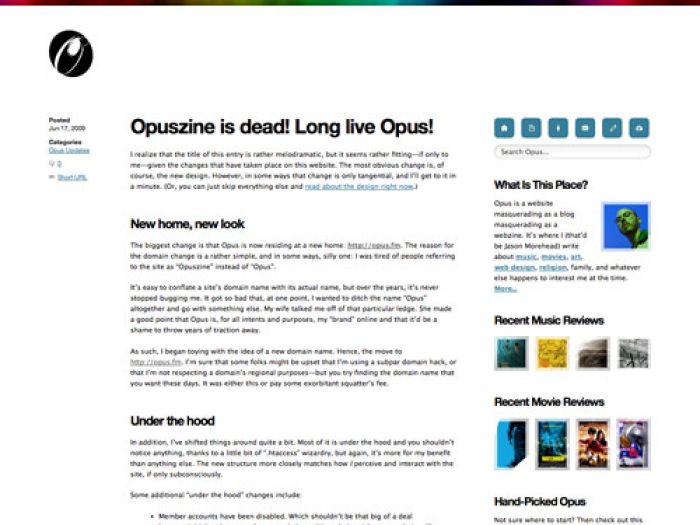
When looking at the new design, a few things should be obvious. First, it’s a three column layout rather than a one column layout, which is what I’ve been using for Opus’ last few iterations. As much as I like the simplicity of a one column layout, there are some disadvantages to that approach that are solved, more or less, with a multi-column layout.
To achieve the layout in an orderly and precise fashion, I made this design the most grid-intensive one yet. Here’s evidence that grids are good: I think this design came together faster than any other design I’ve done to date. After about two or three hours, I had the basic foundation in place. Sure, there was a lot of tweaking, but I made a conscious effort to not dwell on every little detail, but rather, just go with the flow.
To that end, I used several CSS3 features — such as rounded borders — throughout the design. Not only did this mean less time spent pushing pixels in Photoshop, which meant faster development overall, it also means less images and a faster, more lightweight site. However, some of these features aren’t supported by older browsers — I’m looking at you, IE6 — and some of them — like CSS animations — are only supported by Safari.
And FYI, I did very little browser testing for this design. In the interests of rapid development, my focus was on optimizing it for the most recent versions of Safari and Firefox. I did make sure that it didn’t look like total crap in other browsers, but that was about it. Obviously, if this were a client’s site, I’d do more browser testing. But Opus is my site, and frankly, I’m tired of dealing with the deficiencies and failures of crappy browsers. So if you’re using IE6 and something looks off, sorry — Opus looks awesome in Safari.
You’ll also see that I’ve placed several “widgets” in the left column, such as “Recent Music Reviews” and “Recent Movie Reviews,” to try and highlight more of Opus’ content. Another widget — “Hand-Picked Opus” — is an attempt to spotlight older entries that I’m really proud of and don’t want to get lost in the shuffle of 4,000+ entries.
All in all, I’m very pleased with the design — obviously. It allows me to indulge a little and more accurately represent the breadth of Opus’ content without sacrificing much of the simplicity and minimalism that I strive for in any Opus design. I’m sure there will still be some tweaks and adjustments as I settle into it and see how it works “in the wild,” so don’t be surprised if things continue to look a little different for the near future.