It’s True: Safari 15’s Tabs Really Do Suck
Earlier this week, John Gruber posted an article on Daring Fireball that explains, in great detail, why Safari 15’s new tab design is terrible. While Apple’s certainly no stranger to controversial design changes (e.g., skeuomorphism, disappearing scrollbars), Safari 15’s new tabs do seem particularly egregious. Their new design feels entirely gratuitous and unnecessary (i.e., a solution in search of a problem) and worse, it makes the user experience less intuitive and more confusing.
If the definition of a good user interface is one you don’t have to think about while using it — it never calls attention to itself and gets out of your way — then Safari 15’s new tab design is the exact opposite of that. As Gruber puts it:
These new “tabs” waste space because, like buttons, they’re spaced apart. Tabs that look like real-world tabs aren’t just a decorative style. They’re a visual metaphor. My brain likes visual metaphors. It craves them. And my brain is very much comfortable with the particular visual metaphor of tabs in a web browser window. Buttons do not work as a metaphor for multiple documents within a single window. Thus, trying to use the new Safari 15 on Mac (and iPadOS 15, alas), I feel somewhat disoriented working within Safari. I have to think, continuously, about something I have never had to think about since tabbed browsing became a thing almost 20 years ago.
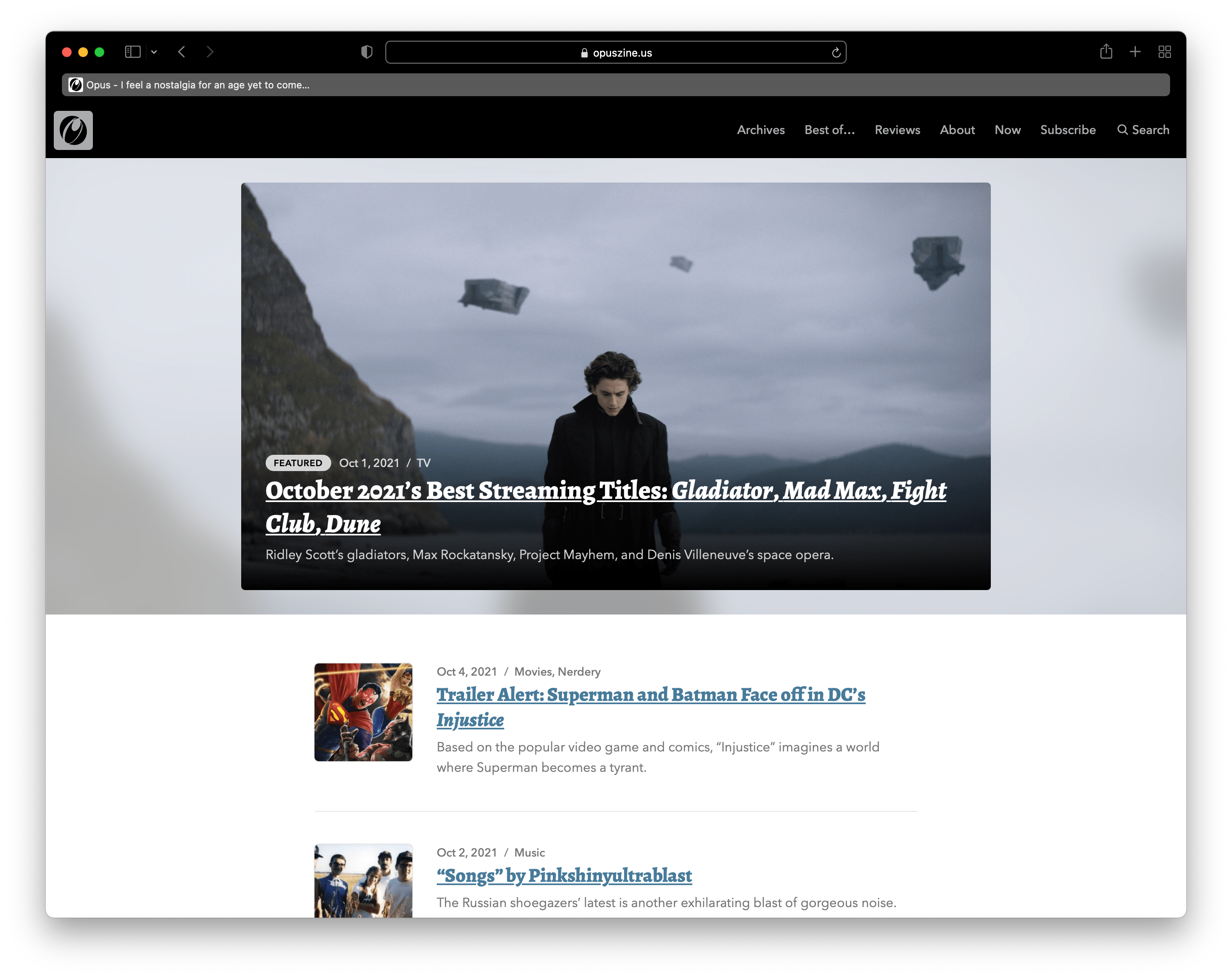
Here’s something about Safari’s tab design that I’ve personally found irksome, something that I’m still trying to learn and get used to, even days after upgrading to Safari 15. Consider the screenshot below:

Here we have a Safari 15 browser window with a single tab displaying the Opus homepage. Let’s say that you want to select the page’s URL, perhaps to copy and paste it into an email or social media post, or because you want to replace it with a new URL to visit.
Where do you click?
It’s a simple question with an obvious answer. I know that long gray strip containing the site’s title and tagline is the tab and not the address bar (or “Smart Search Field,” as Apple calls it). And yet… I almost always click on the tab expecting to be able to get the URL because a) it’s the same basic size and shape as the actual address bar and b) it’s more visually prominent. And when I don’t click on it, that’s only because I spent several moments second-guessing what I was doing and fighting against my own years-old habits.
It’s far too easy to overlook Safari 15’s address bar at a glance because of how it fades into the browser chrome relative to the tab. There’s just a very thin, light — and completely missable — border that sets it apart. Admittedly, that’s somewhat improved if you have Safari 15’s “Show color in tab bar” option activated.

As you can see, the “Show color in tab bar” option incorporates the site’s color scheme into the browser chrome itself, supposedly creating a more visually engrossing browsing experience. However, as Gruber points out in his article, that option comes with its own UI issues, too, and it feels no less gimmicky than the new tab design.
Setting the address bar to show full website addresses might also help a bit, particularly with longer URLs; the added text could increase the field’s visual prominence a bit. But even with the added text, that still doesn’t change the fact that the tab and the address bar look virtually identical.
Now compare all of that to Chrome.

There’s absolutely no confusing the browser’s UI elements. The tab looks like an honest-to-goodness tab while the address bar looks like a field that you type in. Each element is visually distinct, and in a way that reinforces what it does and how you can interact with it. No thinking’s required to know what you click on in order to accomplish a specific task.
Put simply, that’s how it’s supposed to be. Yes, that design convention has been around for a long time, which no doubt increases the temptation to switch it up — but I’d wager that it’s been around for so long because it works. Hopefully, Apple releases an update soon that restores Safari’s previous appearance and removes these gimmicky design updates that serve no purpose and offer no benefit.