Microsoft Vista’s Folder Icons Make a Mess of Things

Last week, Microsoft announced that the long-awaited new version of Windows would be titled “Vista” (which, granted, does sound quite a bit nicer than “Longhorn”). And what’s more, they’re releasing a beta version in early August. C|Net just posted what they claim are the first screenshots of Vista (though screenshots of the OS’ earlier iterations have been floating around for months now). As others have pointed out, Microsoft might have learned many things during the course of Vista’s development, but apparently how to create an attractive and sensible interface isn’t one of them.
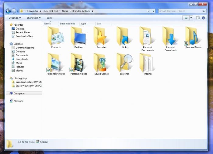
Case in point: Vista’s new folder icon, which can be found on the first screenshot. The “folder” is a pretty ubiquitous concept in the modern OS, one of the building blocks that we take for granted as part of any modern graphical user interface (GUI). It’s one of those interface concepts that most people don’t even think about when they use it — which, by the way, is one of the signs of a good interface.
However, Microsoft, in their wisdom, apparently decided that they couldn’t let the trusty old folder lie. They had to come up with something “fresh” and “new.” So what did they do? They turned the folder on its end. If you look at Vista’s folder icons, they’re now placed vertically, standing up on their ends and opening sideways. “So what?” some of you might be asking. “Looks kind of cool,” others of you might be saying. Seems like a trivial thing, right? What’s the big deal?
If you’ve ever used real folders — like the kind you find in offices everywhere — you know that placing a folder on its end is a recipe for sure disaster. You place a folder on its end the way it’s depicted in Vista and what happens? The folder’s contents don’t stay inside the folder. A little thing called gravity takes over, and next thing you know, your papers all over the place. Which means you spend the next 10 minutes dropping F-bombs as you try to pull everything back together and put it back into place.
I know it seems like a minor detail. But icons are metaphors. Computer icons are intended to translate otherwise arcane computer processes and functions into terms and actions that human beings can understand and use. And naturally, as computer use grows more ubiquitous, we simply begin assuming what the computer icons we see “mean.”
You see a trash can icon on your desktop, and you just assume that’s how you get rid of stuff on your computer because that’s what you use to get rid of stuff in real life. You see a folder icon on your desktop and you assume you can use it to store and organize your information because you use folders in real life to store and organize your information.
We humans make these sorts of connections all the time when it comes to the computers we use, though we’re rarely aware of it. And when something, no matter how seemingly small and insignificant, messes with that connection, it throws up a red flag — something doesn’t feel right. And that’s exactly what’s going on here (in my mind, at least). By changing the folder icon oh so subtly, by making it do something that we know won’t work in the real world, Microsoft upsets the expected and assumed metaphor.
True, it’s a subtle thing, and most folks probably won’t even think about it. It’s one of those little details that gnaws at you because it just feels wrong. But there’s a reason why an interface is described as the look and the feel of a program. If an interface doesn’t feel right, if there’s something just a little off about it — and I think there is something off about those upended folders — the interface isn’t as good as it could be. And at that point, it’s working against itself, even if only on a small level.
I don’t know why Microsoft did what they did to the folder icon, but again, I suspect it was because they wanted to give their OS a “modern” and “updated” look. And I don’t blame them. Vista/Longhorn has practically been vaporware for years, so I bet the folks in Redmond were probably trying to think of every way possible to make the new Windows worth the wait.
It’s not just the folder design that bugs me, however. I realize that I might be somewhat snooty and spoiled, coming from the Mac OS like I am, but Vista just looks ugly and clunky to me. What’s the point of having translucent windows when it makes the background of your windows look an amorphous blob of sludge? What’s the point of having cool-looking bevels when their placement seems arbitrary. What’s the point of having a search bar in the “Start” menu that makes it easier to find a particular application when it’s in the most out-of-the-way place imaginable, the bottom of the menu?
I know the folks at Microsoft aren’t dumb, but seriously, they need to hire people like Mike Matas (one of the guys responsible for the uber-cool Delicious Library), people who know how to design interfaces that look cool, and just as importantly, feel right.