I Could Crap Better Sleeve Art
I began spending significant amounts of money on CDs when I was in high school. However, my musical knowledge was much more limited than it was now. I didn’t have discussion forums, e-mail lists, MP3 blogs, and Pitchfork giving me advice. There were a few artists that I knew and loved, which gave me a place to start as I ventured into increasingly obscure realms of music. But for the most part, a CD purchase was a gamble.
More often than not, I’d buy a CD based entirely on whether or not I liked its sleeve art. My reasoning was that a cool band releasing their cool new CD wouldn’t purposefully choose to wrap it up in lame packaging, with crappy photos and layout. Looking back, it seems awfully naive, and yet, wonder of wonders, I didn’t go wrong all too often. There were a few embarassing missteps, but by and large, that approach worked for me.
Since then, media packaging has always been important to me, first with CDs and now increasingly with DVDs. I still often look to the sleeve art to help me settle into a mood conducive to experiencing the art more fully.

To my mind, a great album or movie deserves great packaging (and all that entails). A great album deserves equally great art whose job is to present the album, whose job is to somehow help communicate and enhance the album and prepare someone for the experience of listening to it every time.
My favorite music sleeve art is that which meshes with the sound contained within the CD. For example, the cover of My Bloody Valentine’s classic Loveless is a blurry, saturated close-up photo of a hand strumming a guitar. It’s nothing terribly complex or wildly creative, and yet it perfectly encapsulates the chaotic-yet-glorious sounds one hears on Loveless.
Another example of this would be the sleeve art that often accompanies releases on the seminal 4AD label, especially the “classic” releases by Cocteau Twins, Dead Can Dance, This Mortal Coil, Diz Juz, Clan of Xymox, and so on. Those covers, designed by Vaughan Oliver, contained imagery, layout, and typography that perfectly complemented the moody, atmospheric sounds of releases such as This Mortal Coil’s It’ll End In Tears and Filigree & Shadow, The Cocteau Twins’ Victorialand, and Clan of Xymox’s Medusa.
The same holds true for DVD sleeve art, if not even moreso given the visual nature of movies. Which is why it annoys me so when I see great and intriguing movies saddled with crappy, uninspiring, and dull artwork.
I Could Eat A Box Of Crayons…

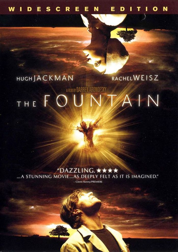
Earlier in the week, I mentioned my disgust over the sleeve art for the DVD release of Darren Aronofsky’s The Fountain. Now, it’s true that I didn’t care much for the movie, but there’s no denying that The Fountain contained some truly powerful and beautiful imagery. Imagery that’s certainly more beautiful than what we see on that sad excuse for a DVD cover.
One wonders why the powers that be wouldn’t use something more akin to the theatrical poster, which is a truly beautiful work, and conveys the epic-yet-personal themes of the film in a much more accurate way than that Photoshop collage ever could.
Another sci-fi film, Serenity (Joss Whedon’s silver screen follow-up to Firefly), also received some crappy art. One can only wonder what thoughts when through the producers’ minds when they decided to put that sultry photo of River Tam up there in the upper left-hand corner. (Perhaps they thought they’d be appealing to the horny sci-fi geek crowd.)
Granted, the theatrical poster isn’t much better, but that sultry photo of River isn’t quite as bad, nor is the design quite as overblown and cramped as the DVD cover. And it could have been worse. We here in the States could’ve received the same art as our British friends, which is truly ridiculous.
Moving away from the sci-fi realm for just a minute, Steven Spielberg’s Munich, one of the finest films of 2005, received a DVD cover that is sorely lacking when compared to the theatrical poster.
The theatrical poster, with its dark, haunting image of Eric Bana hunched over in the shadows, does a fine job of conveying the movie’s darkness and all-too-relevant themes of violence, revenge, and terrorism. The DVD cover, with its gratuitous imagery (do we really need those crosshairs?) and cheesy gold look, does not. The two-disc “Collector’s Edition” is a little better as it features the theatrical poster’s imagery, but spoils things with that big red border covered by a collage of city names — which feels cramped and again, gratuitous.
What Would Gabriel Think?
One of the biggest frustrations with bad sleeve art is that it can potentially misrepresent the movie. A perfect example of that is the DVD artwork for Ghost in the Shell 2: Innocence. The artwork is ridiculously poor, and fails at accurately conveying the stunning and intricate, if cryptic, imagery that fills nearly every frame of the film. Rather, it looks like Dreamworks simply hired a junior high art student to redraw some of the movie’s artwork from memory, and then applied some sort of “Crude-ify” filter in Photoshop.
Furthermore, the artwork is an action scene, what with Batou lunging into the foreground with a nice big gun front and center. If you’ve ever seen the film, you’ll know that it’s most definitely not an action film. There are action scenes, but those are merely setups for the film’s philosophical musings about existence, technology, and the soul.

This is a case where the Brits got it right and used the original Japanese artwork for their DVD release. The image is a little on the disturbing side but there’s an elegant, haunting quality to it that is much more inline with the film’s themes and atmosphere. As for the basset hound, it’s in the movie as well (and serves as something of a Mamoru Oshii inside joke).
Compared to this, the American sleeve art is revealed for what it is: dumbed down.
But Ghost in the Shell 2: Innocence isn’t the only Asian film to be treated like this. It seems like there’s always a problem with Asian movies getting screwed in their sleeve art when they arrive on these shores.
Asian film fans will probably always consider “Miramax” to be a four-letter word, considering how the company jerked around the Asian films they were distributing. Not only would they constantly change release dates — it took two years for Hero to make it to the States, and three years for Shaolin Soccer — and only release heavily edited versions of the films (often without subtitles and with brand new soundtracks), but the cover art would often be misleading

Sometimes the misleading would only be minor (though still annoying). Hero’s American DVD release sports a cover that features Jet Li wielding a curved sword — which he doesn’t wield in the movie. Nitpicky, I know, but little things still count.
Two of the more egregious examples of Miramax’s bungling, however, would have to be the domestic releases of Twin Warriors (aka Tai Chi Master) and The Legend (aka Fong Sai-Yuk).
Both covers feature imagery that isn’t even their respective movies. The action shot in the lower right-hand of Twin Warriors’ cover seems like a collage of two different characters in two different poses from two different scenes from two different movies. And the headshot of Jet Li on The Legend’s cover is actually taken from Fist of Legend (arguably Li’s best movie and another one that Miramax screwed over).
Doing It Up Right
Going through these examples makes me wish more DVD companies and distributors would take a cue from two disparate sources when it comes to releasing DVDs the way they should be released: The Criterion Collection and the South Korean DVD industry.
The Criterion Collection has long been regarded as one of the finest DVD companies out there, issuing releases of hard-to-find, classic, and influential films from all over the globe and giving them the treatment they deserve. This includes remastering older films so they look as good as possible, adding extensive bonus and educational materials, and of course, wrapping them up in absolutely gorgeous packaging and artwork. Just browse through Criterion’s library and you’ll see many examples of DVD packaging done right.
Noone, however, comes to close to South Korea when it comes to loving up DVD releases. Noone gives DVDs the same amount of deluxe treatment, especially in the packaging department. I have several discs in my collection for which the terms “special edition” and “collector’s edition” as they are normally used would fall far short — and they’re the “standard” releases.
The “top of the line” releases — like the packaging for the “Ultimate” edition of The Host or the 3-disc “Collector’s Edition” of Wonderful Days — simply must be seen to be believed.
The Big Deal

So what’s the big deal with crappy DVD covers? After all, it’s not the cover that counts, it’s the movie inside. A good movie is a good movie, regardless of its packaging. And conversely, you can’t polish up a turd of a film with really great packaging.
But it ultimately comes down to an issue of respect — respect for films and those who make them, and respect for those who appreciate, enjoy, treasure, and buy those films. It comes down to integrity. We all know that the motion picture industry is just that, an industry. Box office returns will always trump artistic visions and original ideas. That much is fact.
But even so, not even Hollywood can squeeze all of the art out of the filmmaking process, nor should they try. In the end, even Hollywood must realize that box office fancies and successes change with each passing year, but true art ultimately survives and lives on. And even a seemingly minor gesture like a decent bit of sleeve art is still a gesture that can be appreciated through the years.
I also find myself wondering about the economics. Yes, the movie (and DVD) industry are out to make a buck. But does it really cost that much more to come up with something decent and intriguing, something that’s better than a collage of headshots and/or random scenes that requires only the most rudimentary knowledge of Photoshop?
I wish this was something more DVD studios kept in mind: putting out DVDs with dull, uninspired artwork is basically saying “we don’t give a rat’s ass.” Instead, it’s merely a product to push out the doors and onto the shelves of Best Buy. Sure, they’ll release another edition of the same movie in a few years, with a handful of new features (maybe) but the art will be equally horrid.
It’s actually insulting in a way. It assumes that us consumers will buy anything, regardless of how bad looks, so long as our favorite stars’ names are plastered all over, often as big or even bigger than the actual title of the movie itself. So is it any surprise that people have begun designing their own DVD covers and posting them online for others to download and print off? Folks are frustrated that great movies, or at least movies that they love, consistently receive crappy treatment, and so they take matters into their own hands.
Can’t say I blame them. The “minimalist” art for Serenity is way better than anything the studio ever did. So what does that say about the studio?