Hellgate: London Website Review
It’s been awhile since I’ve done one of these website reviews, partly because I just haven’t seen anything that’s really blown me away. Mind you, I have seen a lot of really solid design courtesy of the various galleries out there, but “solid” design is quite a bit different than “mind-blowing” or “impressive.” But then I saw the website for Hellgate: London a few weeks ago, and it’s just stuck in my head ever since then.
For starters, the website just looks great. That should be a given though, seeing as how this is a video game website. I’ve always thought that video games should have some of the finest-looking websites out there, especially given the industry’s current fixation on offering up the latest and greatest in visuals (which is rather misguided, but that’s for a completely different entry). However, most game websites seem rather ho-hum to me, almost like an afterthought. Sure, they might offer a lot of information, which is very important, but the design always seems rather utilitarian and underwhelming.
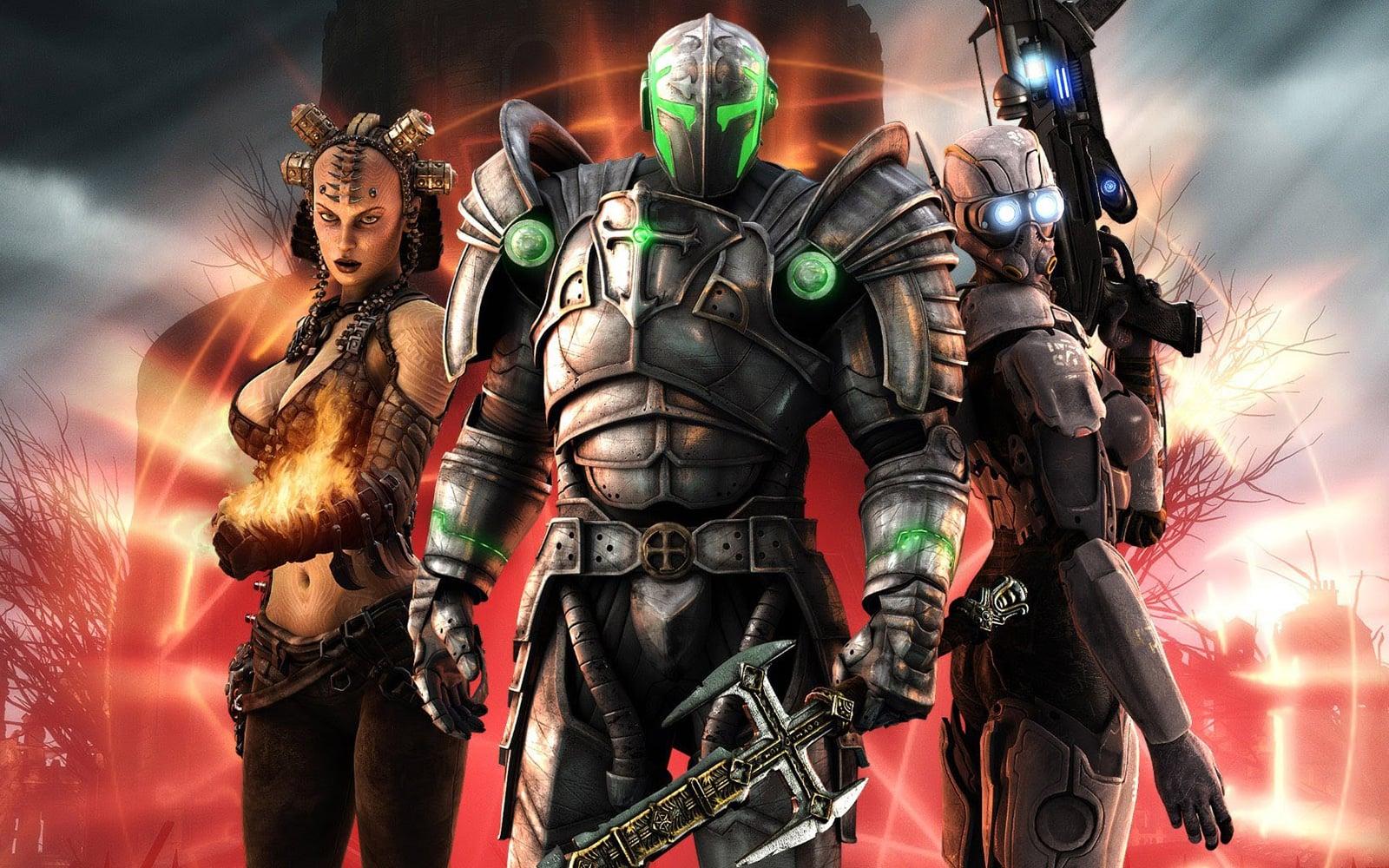
Not so with Hellgate: London’s website. Utilizing a nice blend of wonderfully-done Flash and CSS, the site implements in-game graphics, concept art, and movies in a way that seems perfectly inline with the game’s dark, eerie atmospherics. Maybe it’s just my inner D&D geek talking — you know, the guy who spends an hour or so looking through the game manuals at Barnes & Noble — but there’s nothing more bad-ass than those images of the Templars holding swords at the ready, their armor glowing with arcane energy. And while the design is thoroughly slick and modern, there are little bits and pieces here that add a bit more of a worn, antiquated feel — which is also inline with the plot’s blending of magic and technology.
And the designers get bonus points for their attention to detail. For example, go to the “Weapons” section of the site and look at the “Database Search” in the right column. Notice those swank looking checkboxes? At first glance, it looks like a Flash-designed form, but the designers are using some clever JavaScript to swap out the boring old checkboxes with fancy graphics. (Read Maratz’s write-up on this technique.)
It seems like a little thing, and it is, but it’s just one more level of consistency achieved within the design. It’s rare that you see a design so thoroughly implemented that even the look of checkboxes are taken into consideration, not to mention the other little interface widgets sprinkled throughout the site. And even better, it degrades nicely; turn off JavaScript and you can still use the form (though it doesn’t look nearly as cool now).
Of course, no design is perfect, and there are a few places where Hellgate: London’s site bogs down. As was mentioned previously, the Flash mastheads look great. But they are rather large, which pushes content down quite a ways, forcing you to scroll a lot — especially if you do any of the searches on the site (for example, selecting just a handful of Weapon or Demon types).
Also adding to the scrolling is the layout of the various information screens. Again, go to the “Weapons” section, and you’ll see a list of over 20 weapons. Click on an item, such as the “Firebrand.” Rather than take you to a “details” page, the entry’s row in the table expands and displays the item’s info within the table.
Perhaps the designers wanted to keep things streamlined with this approach, but it seems to me to be even more confusing. Because the browser refreshes when you click on an item, it feels like you’ve gone to a new page when in fact, you’ve just jumped down the page to the selected entry. All of the other entries are still visible, albeit in a condensed form, above and below the selected entry. Which proves a little disorienting. Perhaps if the designers had chosen to use some sort of effect that makes the selected item’s row slide open or expand dynamically, the screens would be a little easier to navigate.
Overall, the Hellgate: London website is an impressive piece of work, blessed with some very strong visuals and full of in-depth information that is updated on a nigh-weekly basis. This definitely sets the bar high for subsequent game websites.