The Captain Marvel Website Is as ’90s as a Website Can Be
When you visit the website for Marvel’s upcoming Captain Marvel movie, you might think that your internet connection has somehow broken the space-time continuum, and taken you back to the world wide web of the ’90s in all of its awful glory.
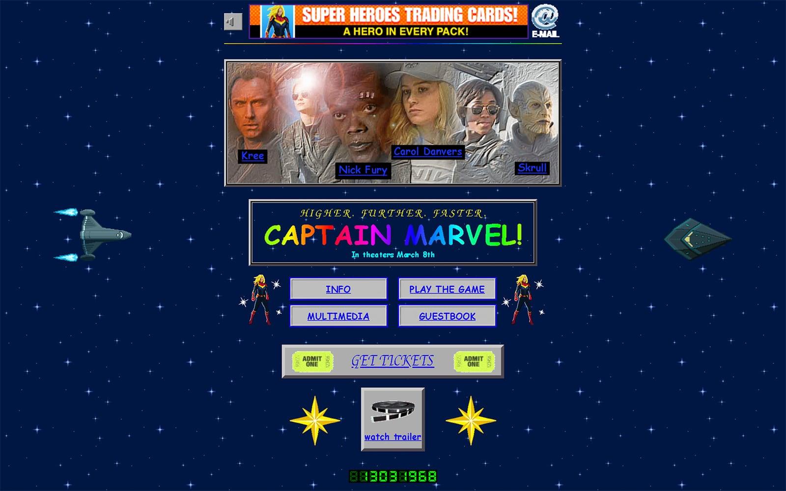
I mean, Captain Marvel’s website has it all: crappy-looking animated GIFs, lots of garish repeating backgrounds (some of which are animated, as well), rainbow text, a counter, a guestbook, broken image links, and even some honest-to-goodness blinking text (via blink tags, of course). I love everything about it. And it’s perfectly in-line with the film’s ’90s setting.
But what I love most is that not only did Marvel’s marketing team take the time to make it look like an authentic ’90s website (i.e., basically every GeoCities site ever, or the Space Jam website), they also took the time to make it responsive and mobile-friendly. In other words, they built a distinctly ’90s-looking website with modern web development techniques.
It’s sort of like the best of both worlds, if you think about it. Via