Bibliotheca: What’s the Point of Making the Bible More Beautiful?
When I graduated from high school, my parents gave me a study Bible for a present. It was packed with supplements: book introductions, historical information, a version of Strong’s Concordance, and best of all, hundreds of notes that sought to explain the Bible’s more challenging passages. All of it was intended to make the Bible more accessible.
Eventually, though, I wanted something simpler. As interesting as it was, all of that extra information often got in the way of the Biblical text; I spent more time reading the supplements than actual Bible verses, and so I got a “traditional” Bible with just chapter and verse numbers and minimal supplements.
These days, even such a “traditional” Bible might be too much. For example, Crossway recently released the ESV Reader’s Bible, which removes chapter and verse numbers altogether and presents the Bible as an unbroken narrative “for those who want to read Scripture precisely as it was originally written.” Such a Bible shouldn’t come as a surprise; digital Bibles already offer distraction-free reading modes. In an age where so much supplemental information is merely a Google search away, and where countless apps, services, and lifehacks seek to improve productivity by reducing information overload, the ESV Reader’s Bible is a natural evolution for the Good Book.
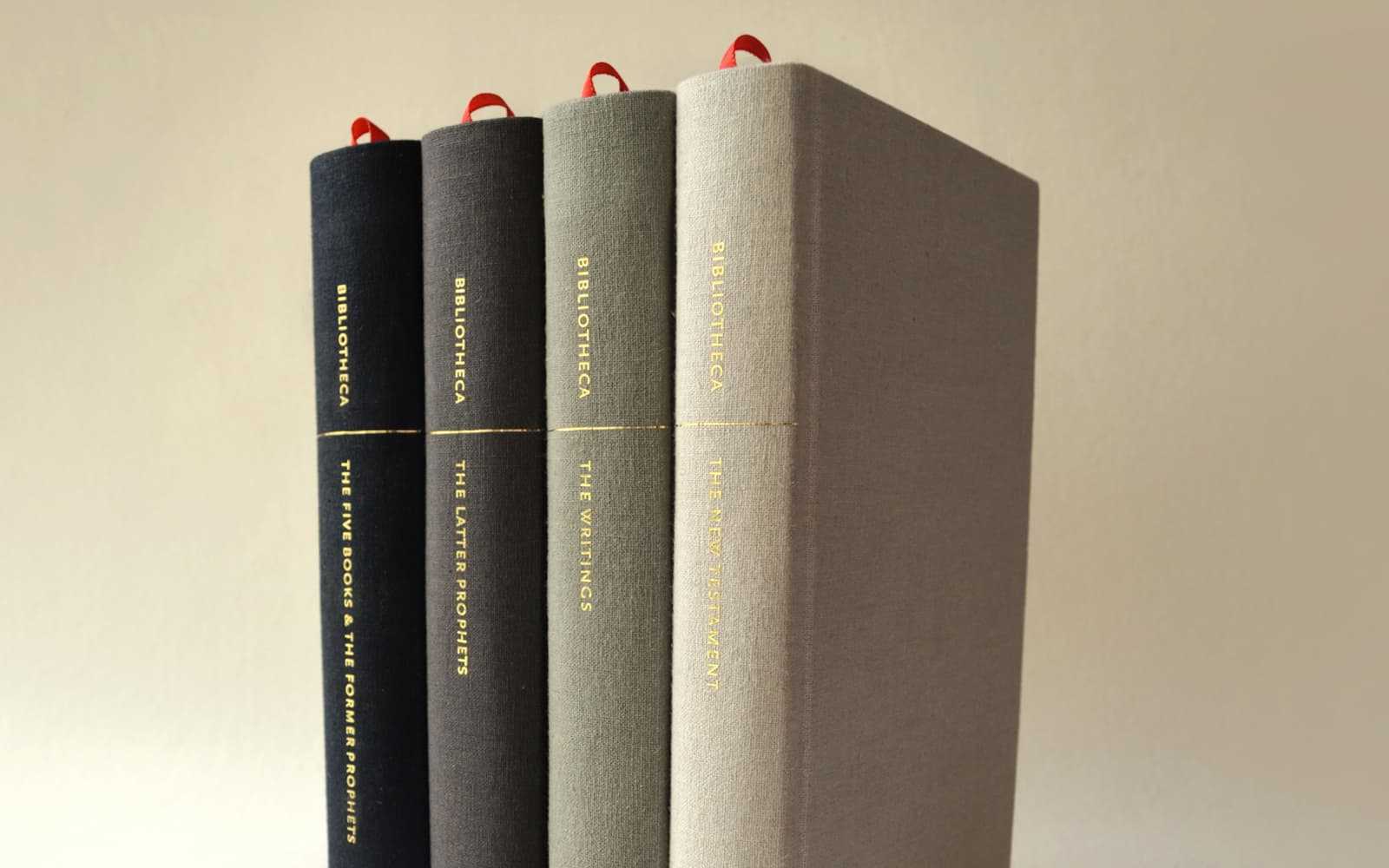
But then there’s Adam Greene’s Bibliotheca project, which is nothing less than a complete redesign of the Bible intended to create a more enjoyable reading experience. Similar to the ESV Reader’s Bible — and the complete antithesis of my old study Bible — Bibliotheca removes all numbers, notes, and supplements. As Greene explains, “Today, our contemporary Bibles are ubiquitously dense, numerical and encyclopedic in format; very different from how we experience other classic & foundational literature, and completely foreign to how the original authors conceived of their work.”
In addition to stripping the text down to the bare essentials, Bibliotheca treats the Bible as a work of art. To that end, Greene is sparing little expense: he’s using a layout inspired by the Ark of the Covenant’s dimensions, high-quality binding and paper (as opposed to the thin, transparent stuff usually associated with Bibles), custom typefaces, and thoughtful typography, among other things.
In a recent interview with The Verge, Greene discussed the project’s inspiration:
For even more on Greene’s approach and aesthetic, watch the video below:
There’s no denying that Bibliotheca is a true labor of love. The simple fact that, in order to create his custom typefaces, Greene taught himself traditional letterforms (he wanted to “mimic the reverence that’s given to text in Hebrew traditions”) should make that plainly clear. As a designer myself, I can’t help but applaud his attention to detail and desire for excellence. And I’m not the only one; his Kickstarter project has raised over a million dollars to date, far surpassing his original goal of $37,000.
But is this all really necessary? Must we approach the Bible like a work of art? Should we? What does hand-crafted typography have to do with “piercing to the division of soul and of spirit, of joints and of marrow, and discerning the thoughts and intentions of the heart?”
Obviously, if any book deserved the sort of deluxe treatment that Greene describes in the video above, it’s the Word of God. You can buy lavish editions of The Lord of the Rings, the Harry Potter series, and even Calvin and Hobbes, so why not the Bible? But at the same time, it all seems so, well… lavish. Maybe even a wee bit idolatrous? We Christians hold the Bible in high regard, but we don’t worship it. Instead, we take “pride” in the Bible’s accessibility and common-ness: it’s not some arcane text that only a privileged elite can read and study. It’s available to anyone and everyone, translated into countless tongues, so ubiquitous that you can even find one in your hotel room.
So again, are Greene’s expensive efforts really necessary? Can such a finely produced Bible lend itself well to evangelism, to teaching, to proclaiming the Gospel?
Ultimately, this is a question of pragmatism versus aesthetics, and it goes beyond Bible design. An obvious parallel exists concerning church architecture. I once got into a discussion concerning Saint Cecilia’s, a massive cathedral that dominates Omaha’s skyline. I was praising the building’s beauty — and lamenting that Catholics always have the best architecture — when I was rebuked. Such grand architecture was unnecessary, I was told, and a waste of money — money that could’ve been used for a truly worthwhile ministry, like helping the poor or funding missionaries.
Similar things could be said about Bibliotheca. All of that time, money, and effort could be put towards something more practical and necessary, like translating the Bible into a language that doesn’t have it yet or printing thousands of cheap copies to hand out for free.
Such statements may contain wisdom, but they also gloss over the ministry that aesthetics and beauty can have, i.e., creating transcendental experiences that shake us from this world’s mundanity and point towards God. A ministry of beauty may not be obvious or practical, but it’s not unimportant, and can serve a singular role. Rod Dreher has written about this topic often, and usually in relationship to a religious experience he had at Chartres Cathedral that challenged his agnosticism — an experience created, in part, by the cathedral’s architecture. As he puts it:
[W]hen you have truth united to beauty, you have something very powerful indeed. Beauty is unsettling because our response to it is visceral, not intellectualized. We are not pure minds, but our minds are incarnate, inseparable from our bodies. Beauty seduces. The question of whether or not it seduces one towards truth and light, or towards falsehood and darkness, is a separate one, but not nearly as separate as we might think.
Aesthetic experiences are “visceral” in that they slip past our natural, rational “defenses” and cut us to our core, whether we’re talking about typefaces or flying buttresses, book binding or stained glass windows. And what could be so visceral as holding a book in your hands, feeling the texture of the paper and the solidity of the binding, smelling the ink, and letting the typography guide your eyes a little deeper into the story contained within its pages? If that can make for a powerful experience with a “normal” book, then how much more could that be the case for the Book of Books?
This entry was originally published on Christ and Pop Culture on .